
What makes a quality rendering
This page covers the technical standards of an acceptable rendering — what you should compare when evaluating studios. To order the service, please see our Architectural 3D Rendering page.
- Four criteria you can check by eye, no technical expertise required
- Six signs of a substandard image, and how to name each flaw precisely when requesting revisions
- This page isn't a sales pitch — use it to score anyone's samples
Why we wrote this page instead of showing off samples
When choosing a visualization studio, you are almost always sent the best images it has ever produced. That set says nothing about how your project will turn out — only that somewhere, at some point, they managed it.
What's more useful is a set of criteria you can score against yourself. With criteria in hand, you can open any studio's samples, zoom to 100%, and see for yourself where the work is solid and where it was rushed — ours included.
This is also what makes sign-off less tense. Most disputes over delivered images aren't about sloppy work, but about the two sides lacking a shared language for describing what isn't right. The client says "it doesn't look real", and the studio doesn't know what to fix; after the fix, the client still feels it isn't real. Name the flaw correctly and one revision round is enough.
This page doesn't take orders. Scope of work, per-view pricing and the approval process are on our Architectural 3D Rendering page.
Four criteria for judging a rendering
You can use these four points to check any studio's samples, including ours.
Light with a direction and a time of day
A good image makes it clear where the sun is coming from and at what time of day. Shadows are consistent across every object, with soft transitions at their edges. Weak images tend to be evenly lit throughout, with no identifiable light source.
Materials that hold up at close range
At 100% zoom, concrete should show its pores, glass should correctly reflect the surrounding scene rather than being a flat blue block, and timber grain should be in proportion to the board size.
Context true to the real site
Vegetation suited to the climate, vehicles and people true to the local setting, a skyline that matches the surrounding terrain. Compositing in an unrelated context loses the viewer's trust even when the building itself is well modeled.
Resolution suited to the final use
Images printed as large-format banners need far higher resolution than images posted online. Define the final use when you place the order, because enlarging later always gives worse results than rendering at the right size from the start.
Six signs an image falls short
This is the flip side of the four criteria above, written so you can spot flaws right on screen. Each item comes with a how to check — a concrete action, not a vague impression.
Even lighting, no clear light source
The whole frame is evenly lit, no surface darker than any other, with faint or missing shadows. The image looks clean but flat, and viewers can't tell what time of day it is.
- How to check: find the shadow of a tree or column. If you can't tell which direction the sun is coming from, the image isn't up to standard.
Glass reads as a flat block of color
The entire glass surface is one flat shade of blue or grey, reflecting no sky, trees or buildings opposite. This is the most common flaw in high-rise renders, and it makes the whole tower look like a plastic model.
- How to check: zoom into a pane of glass. You should see something of the surroundings reflected in it.
Pasted-in trees and people that ignore the lighting
People and trees are composited from stock libraries but keep the lighting of their original photos, so the sun on them comes from the opposite direction to the sun on the building, and their feet cast no shadows on the ground.
- How to check: look at people's feet and the base of trees. No shadows, or shadows falling in a different direction from the building's, means sloppy compositing.
Jagged edges at 100% zoom
The line between roof and sky, or the edge of a railing, shows up as stair steps instead of a smooth line. A sign the image was rendered at low settings to save time, or upscaled from a smaller one.
- How to check: zoom to exactly 100% where the roof meets the sky — don't view it fit-to-screen.
Material texture tiles into a grid
Tiles, stone or timber repeat an identical texture pattern on a regular grid. The human eye picks up patterns very quickly, so it's instantly obvious this is a computer-generated surface, not a real material.
- How to check: step back and view a large wall area as a whole. If a regular grid pattern emerges, the texture is repeating.
A color cast over the whole frame
The whole image leans yellow, blue or purple — usually the result of a color grade applied over everything. It's most visible in areas that should be white or neutral grey.
- How to check: find an area that should be white — a white-painted wall, clouds, road markings. If it isn't white, the whole image has a color cast.
How many pixels the intended print size needs
| The print-industry math | This is the print industry's standard formula, not a Lotuz delivery commitment: pixels = inches × DPI. Quick conversion: one meter is about 39.4 inches. |
|---|---|
| Handheld print, viewed up close | Brochures, flyers, presentation books — printers typically work at 300 DPI because readers hold them close. A landscape A4 page corresponds to roughly 3,500 × 2,500 pixels. |
| Boards and signs viewed from a few meters | Presentation boards, framed wall prints — the viewing distance is greater, so 150 DPI is enough. A board 1 meter wide corresponds to about 5,900 pixels across. |
| Large banners viewed from a distance | Construction hoardings, event backdrops — viewers stand tens of meters away, so printers drop to 72 DPI or lower. This means a 5-meter banner does NOT need the enormous image intuition suggests. |
| Screens and social media | Not calculated by print density. Go by the width of the display area — 1,920 or 2,560 pixels is usually enough; anything larger only slows the page down. |
| Why upscaling later always falls short | Upscaling a small image to a large format adds no information — the software only guesses the pixels in between. Rendering at the right size from the start gives a completely different result, which is why the question "where will it be printed, and how large" belongs before production, not after delivery. |
| Decide before production, not after delivery | For this reason, settle three questions when you place the order: where the images will be used, the largest print size, and whether you plan large-format banners. These three answers determine the render resolution, and rendering at the right size from the start costs far less than a last-minute fix before printing. |
When you receive the images: how to check and how to describe flaws
Most second and third revision rounds stem from describing the problem inaccurately, not from the studio refusing to fix it. The two columns below cut that short.
What to check as soon as the images arrive
- Open it at 100%, not fit-to-screen — edge and texture flaws only show at this level.
- Check the shadows first: one sun direction for the whole frame, including composited people and trees.
- Zoom into a pane of glass and a large material area to check reflections and repeating textures.
- Find an area that should be neutral to catch a frame-wide color cast.
- Compare the context with real photos of the site: trees, vehicles, skyline.
- Check the file dimensions against the intended print size, using the table above.
Name the flaw instead of saying "it doesn't look real"
- Instead of "the image looks flat" → "the sun direction isn't defined; please choose a specific time of day".
- Instead of "the glass looks bad" → "the glass isn't reflecting its surroundings; it's a flat block of color".
- Instead of "the people look fake" → "the composited people have no shadows and are lit against the sun direction".
- Instead of "the image is blurry" → "the roof edge is jagged when viewed at 100%".
- Instead of "the wall looks cheap" → "the material texture repeats in a regular grid".
- Instead of "the colors aren't nice" → "the whole frame has a yellow cast; the white wall no longer reads as white".
Image quality must hold up inside a 360 tour
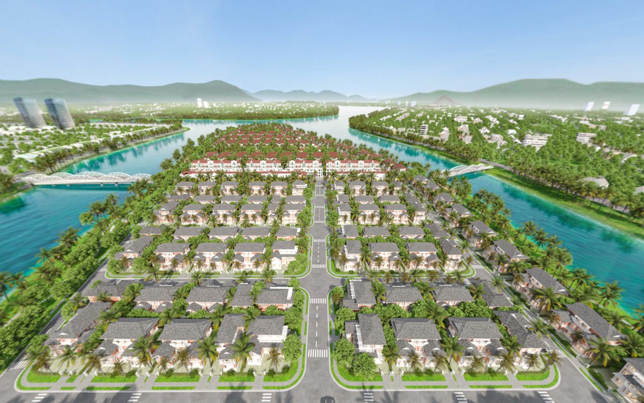
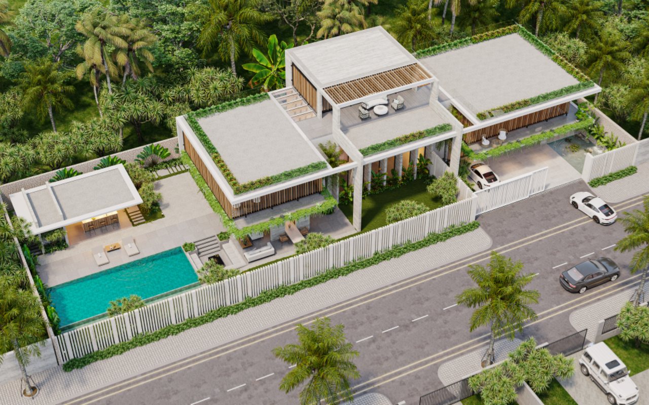
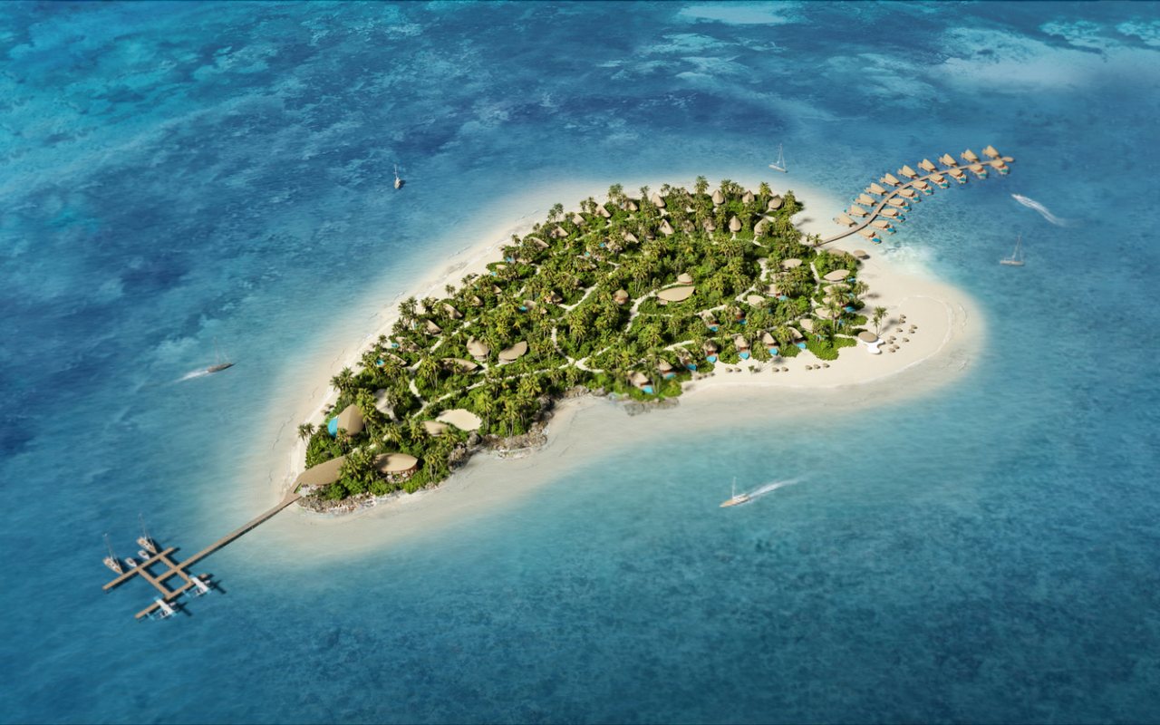
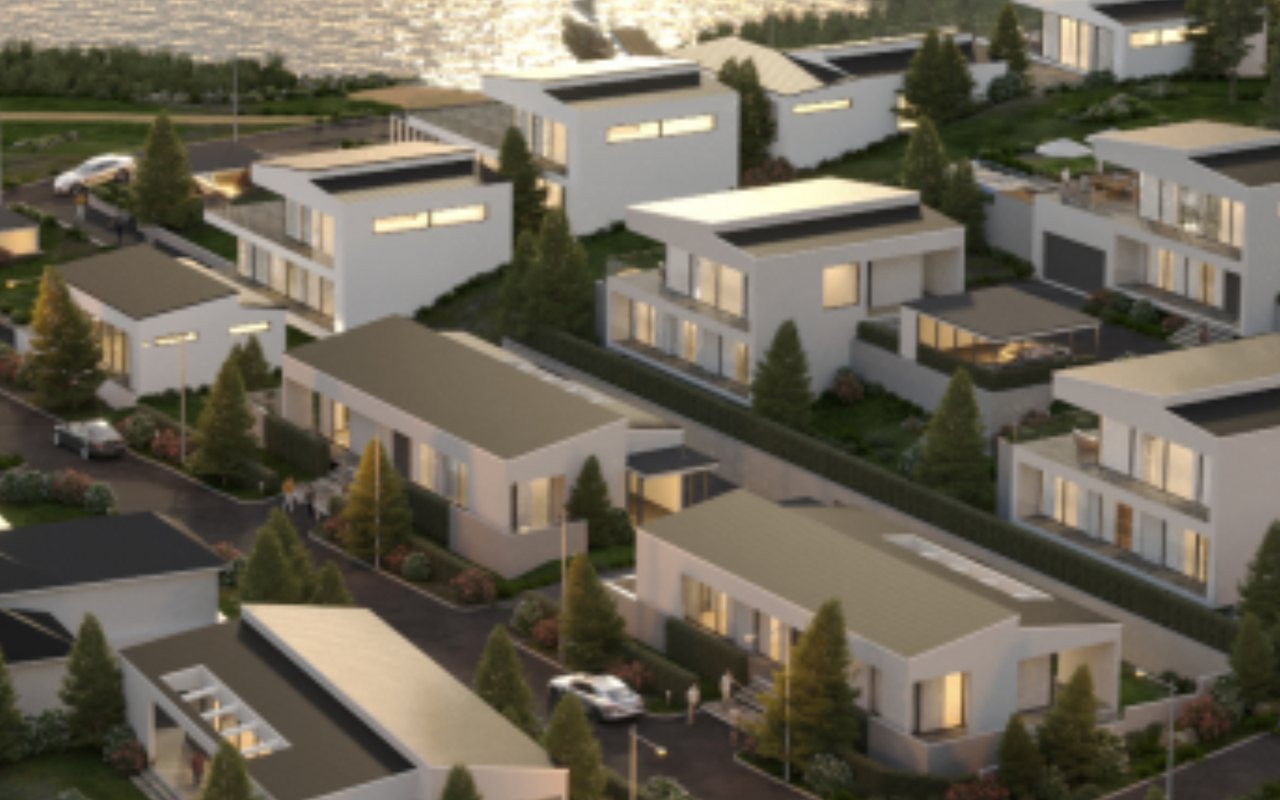
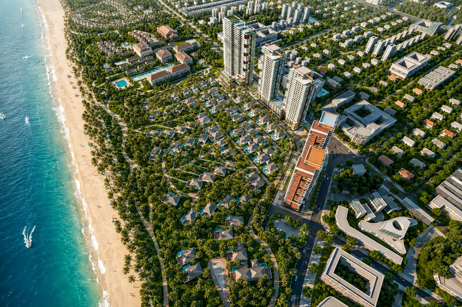
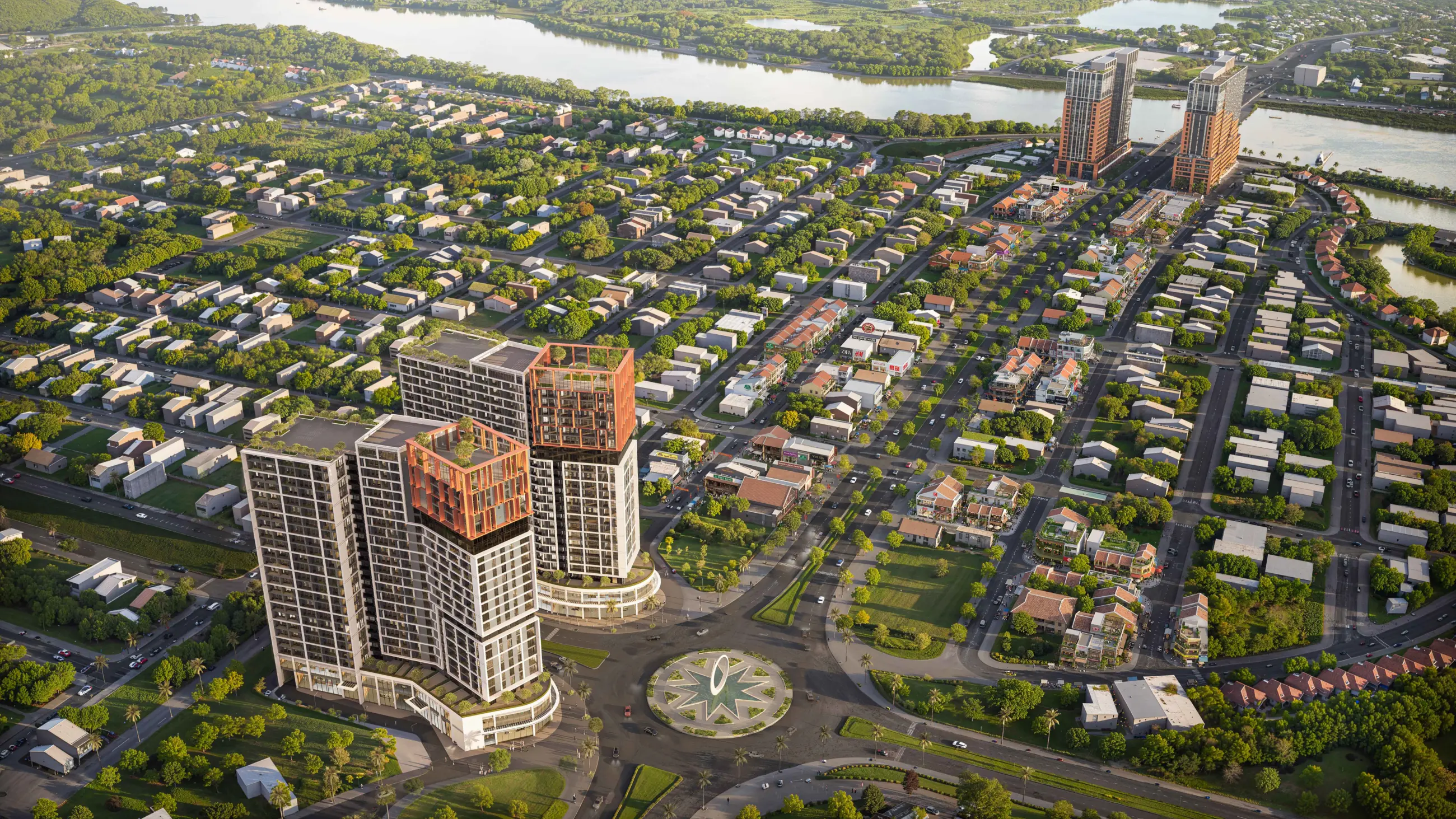
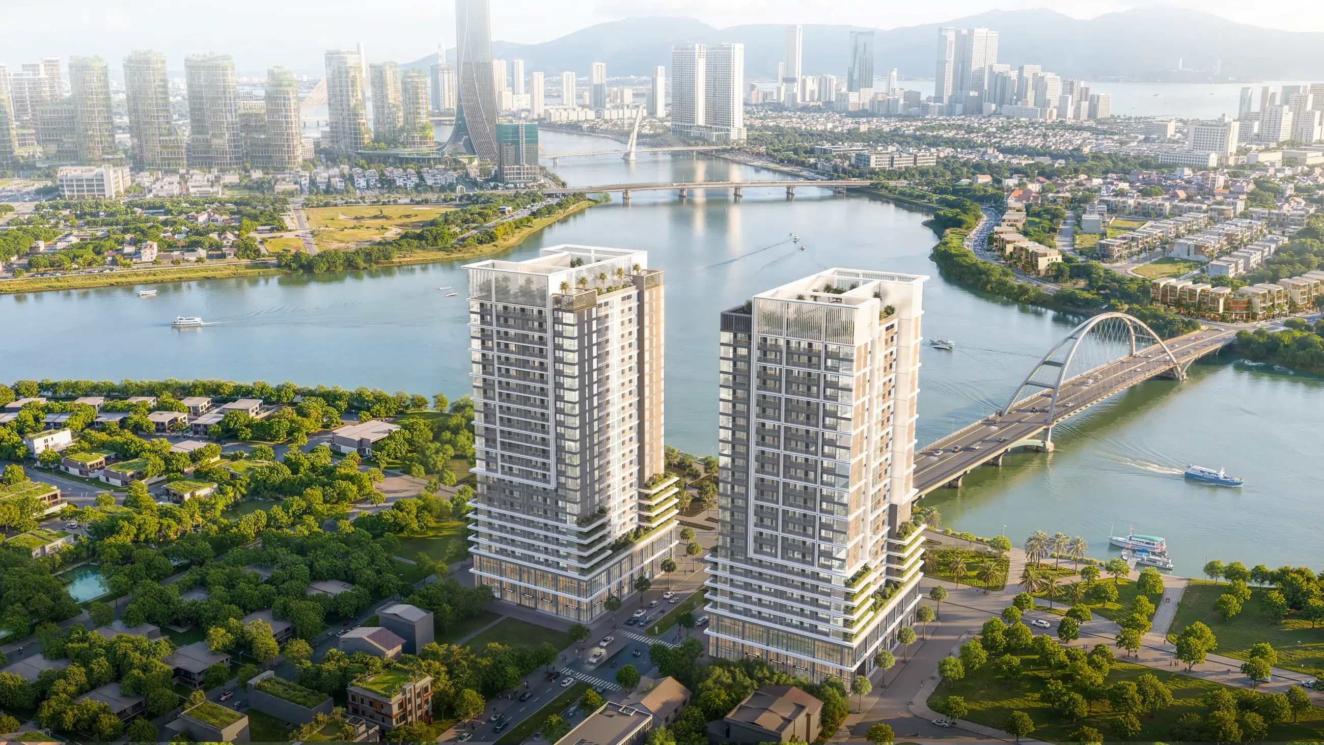
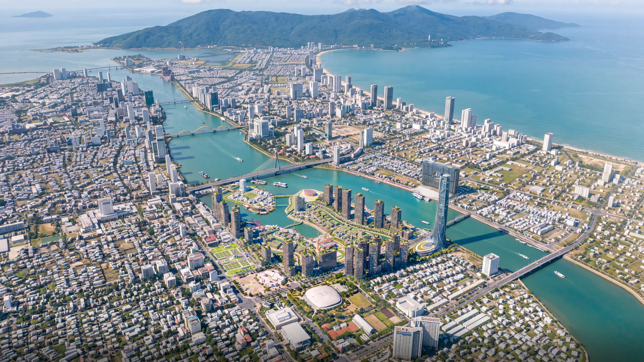
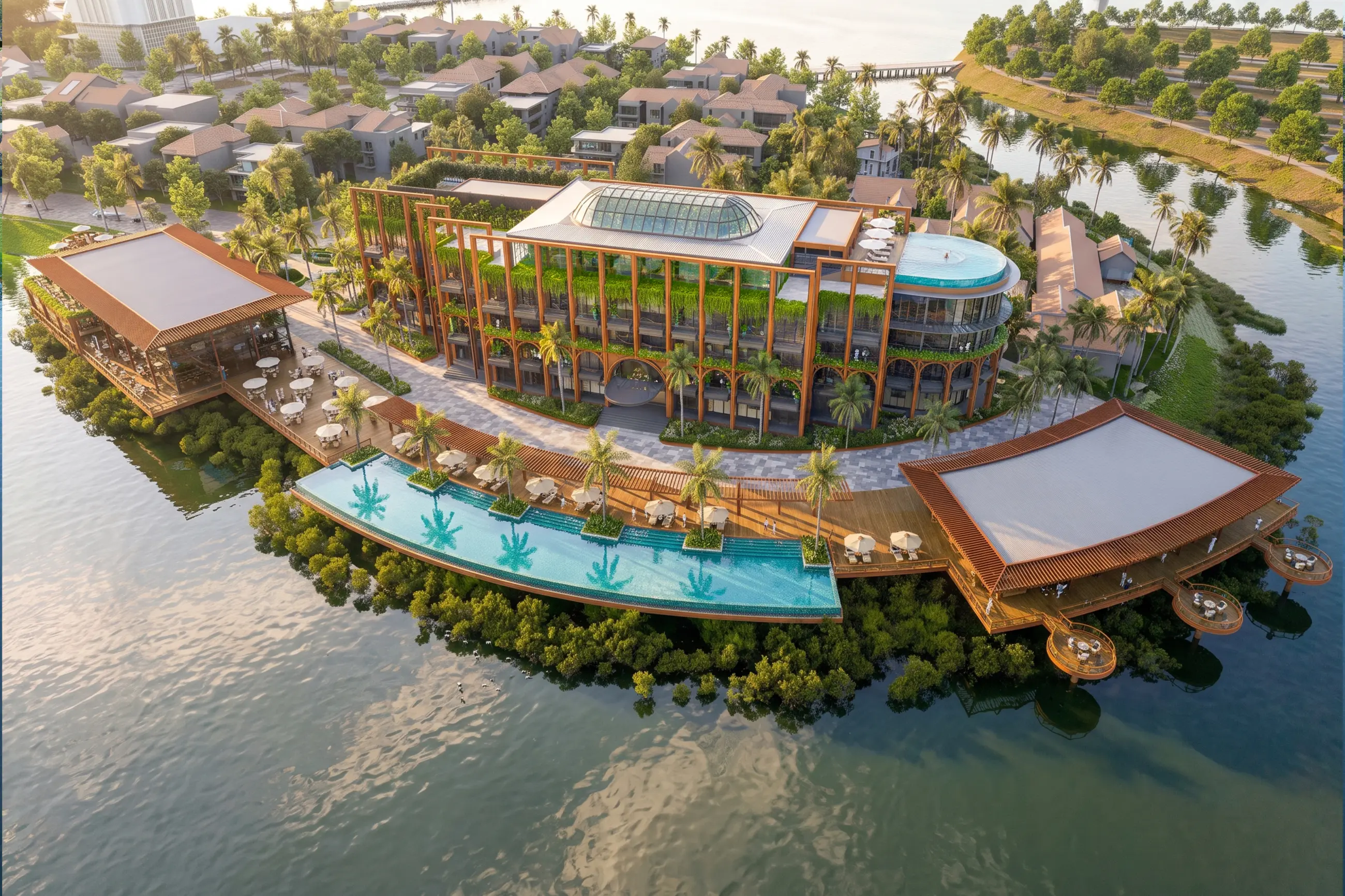
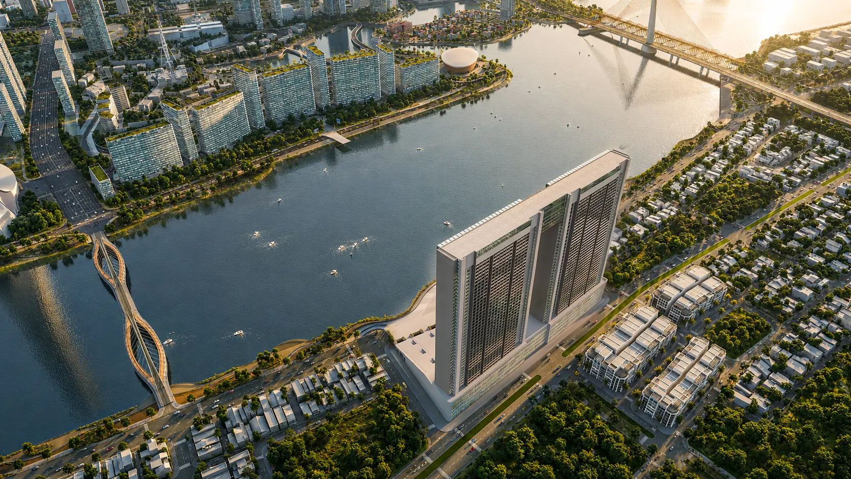
One criterion few people check until late: an image that works as a still may not hold up inside a tour, because viewers zoom into any spot they like instead of looking from a preselected angle. The four tours below can be opened and inspected right now.
Check it against real projects
Open each project and zoom in to check the four criteria above for yourself — and look for the six signs of a substandard image as well.
FAQ
Why does Lotuz show you how to spot flaws, even its own?
Another studio's images look great — why should I still check them?
We're not specialists — isn't this kind of checking too difficult?
If an image meets all four criteria, is it guaranteed to be a good image?
Should I set the print size before ordering, or can it wait?
Rendering or real photograph: which is higher quality?
Can I place an order through this page?
Capabilities and technology
Lotuz Studio does not rely only on off-the-shelf commercial software. We build our own in-house tools for our own workflow — the practical reason we can shorten timelines and keep pricing stable.
Lotuz.AI — our in-house AI toolkit for Photoshop
Controlled image generation, relighting and resolution upscaling, running directly inside Photoshop. It is a commercial product on public sale at lotuz.ai.
- What you get: a much shorter post-production stage, so we can take on rush requests too
A sync bridge between SketchUp and 3ds Max
An in-house tool that pushes changes from a SketchUp model to a 3ds Max scene while keeping the materials and lighting setup already in place.
- What you get: mid-project design changes do not force a scene rebuild from scratch, so the schedule does not slip
AI image processing that runs on our own workstations
Background removal, selection and edge refinement are processed locally in our office; files are never uploaded to third-party cloud services.
- What you get: unreleased project files never leave our systems
Our own 360 tour management system
We build and manage tours ourselves on krpano, including multi-resolution image tiling so tours open fast even on weak connections.
- What you get: tours you control yourself, with no dependence on a foreign platform subscription
A ten-person team doing the work directly
The person you talk to is the person who does the work. No call center, no coordination middlemen, no handoff to a third party.
- What you get: focused technical feedback from the very first conversation
Multi-format input files
We accept models from SketchUp, Revit, 3ds Max and Rhino, as well as CAD drawings. For projects without a model, 3D modeling is quoted as a separate item.
- What you get: no file conversion needed before sending your documents
Order visualization services
For a per-view quote and to discuss scope, please see our Architectural 3D Rendering page or contact us directly. If you have another studio's image set and want a second opinion, send it over — we'll check it against the same six signs above.
- Building type and location
- Final use of the images: documents, boards, large-format banners or social media
- Largest intended print size
- Whether drawings and a 3D model are already available